Deception in Graphics and Statistics
Background
My wife and I were at our sister’s place and while we were there, I found a graphic on Facebook that bothered me greatly. I make it a point to ensure that all of my work can rigorously withstand scrutiny. I won’t tell you something if I can’t show you how I got it and why it’s the way it is. The post, put there by an old high school classmate, showed a graphic that disturbed me because it appeared to be deceptive. This the graphic in question:
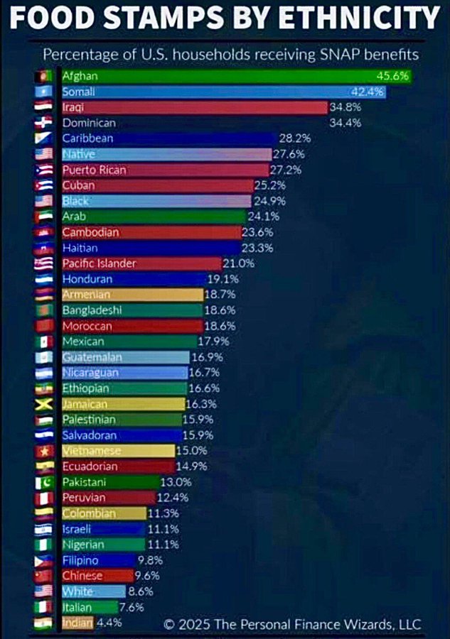
This graphic appears originally on the blog of The Personal Finance Wizards. This group, per bizapedia.com, is a registered LLC in Arkansas and has the Asa Hutchinson Law Group as its registered agent. So, knowing that Mr. Hutchinson is a former Republican Governor of Arkansas, you can expect a conservative bent and misleading information.
The LLC describes itself as “group of personal finance experts dedicated to providing content on money, savings, and investing education.”. Also, to their credit, their website does have a disclaimer that states:
The Personal Finance Wizards, LLC makes no claim or representation as to the registered trademarks or copyrighted works of others, nor any claim as to the data and tools cited, sourced or referenced herein.
So, in essence, “We’ll put this out there, but we’re not responsible if it’s wrong or misleading!” That is an ethical problem in my opinion. As my wife and I discussed the graphic, we found more problems with it, along with a lot of people who accepted the intent of the message that comes from the graphic.
I ended up speaking to my Toastmasters club about the graphic and how it was misleading and deceptive. After discussing the speech with my wife, I decided that I had the material to turn it into a blog post as an example of misleading your audience with statistics and presentation.
The Problem
The graphic, as seen above, is a horizontal bar chart that lists different “ethnicities” that receive SNAP benefits. The first problem is how they define “ethnicity”. There is a blending, deliberate, in my opinion of ethnicity, race, and national origin. For example, the first listing in the graphic, Afghani, is misleading because it does not make clear if they are discussing ethnic Pashtuns who comprise about 42% of Afghanis and who may also be called Afghani in country of if it comprises other ethnic groups prevalent in Afghanistan such as Tajiks, Hazaras, Uzbeks, or other ethnic or tribal groups who reside in Afghanistan. Further, this graphic does not distinguish between immigrants from Afghanistan who have been in the US, legally, for more than five years and meet the other eligibility requirements and US Citizens who are ethnically connected to Afghanistan.
Additionally, some “ethnicities” such as Arab reflect vastly different groups that are loosely classified as an ethnic group by lingustic heritage, unless they are from a specific country then the nationality is reflected. This appears in the entry for Iraqi, where Arabs, Kurds, Assyrians, Armenians, and Turkmen can all be classified as Iraqis. Additionally, some groups such as the Yazidi, are religious minorities who may be classified as Iraqi.
In the graphic, Pacific Islanders are represented by a Hawaiian Flag, which feels very misleading. The Caribbean is listed as a single “ethnicity”, but there are several different ethnic groups who live in the area, and the graphic has separate distinctions for many nationalities in the region, regardless of their ethnicity. LatinX communities are also separated by nationality and not ethnicity.
For “ethnicities” represented with an American flag, Indigenous Americans are listed as “Native”, African-Americans are listed as “Blacks”, and then there are, towards the bottom, “Whites”. By now, you see the picture. The implication is that immigrants are the problem. This plays fast and loose with the data.
Numerical Deception
Since neither the grpahic shown above nor the original blog post are clear about how a household is defined and ethnically classified, the percentages are even doubly deceptive. If you use ethnicity and nationality together, several sources including this one place the population at around 200,000 individuals. If all of those individuals were eligible for SNAP benefits, then the eligible population would be about 91,000 people. That’s not a significant portion of the population of the United States. In fact, the same group that published this graphic, published a second article three days later that broke the same data down by volume. That graphic, shown below, paints an entirely different picture.
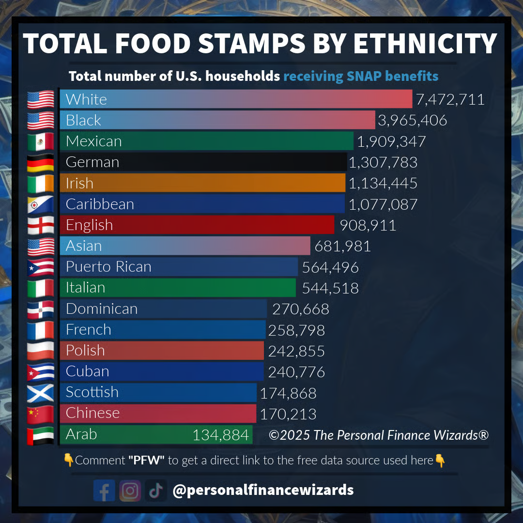
In fact, from this graphic, the Afghani ethnicity does not appear in the list. The number of households is that small. Instead, “Whites”, at the bottom of the percentages, just above Italians and Indians, turns out to be the largest in volume. This is where the deliberate deception skews the message. The first published graphic had an agenda. “Look at all the foreigners getting things that you don’t.” It’s not true, but it makes for good outrage bait. The group doesn’t define the terms, so they don’t have to clarify what they want to imply. They made the dog whistle at just the right frequency to ensure the point was made and people are distracted from the truth and swallow the deception like pablum.
After publishing both graphics they add text in the second entry to exonerate themselves:
It’s important to note that the graph highlights a selection of ethnicities we felt would be most relevant and engaging for our audience. With hundreds of ethnic groups in the U.S., it’s not possible to include every single one in a single post. If there is a group you would like to see represented, let us know or check out the full table available from the U.S. Census.
So the second graphic is cherry-picked to both give you some truth, but also continue to stoke the fire from the earlier post. I do appreciate that they added additional informative text:
It’s also worth noting that we used a logarithmic scale for the y-axis with tick marks at 10K, 100K, 1M, and 10M to better display the wide range in SNAP household counts. This approach helps make the lower numbers like those under 1M visible while still keeping the larger outliers like the White and Black data points in context. Without the log scale, most of the smaller groups would practically be invisible on the graph.
This admission is good. We should always make clear to our audience when the scales have been changed for legibility. However, I disagree with their assessment that this keeps those points in context. It merely presents the data in a way to ensure that there is some legibility and counts on the fact that their audience may not read the remainder of the post.
My two cents
I think that I’ve demonstrated how this was a deliberate attempt to misinform an audience and, equally, play to an intended audience’s biases. That’s unethical. I work hard, as do most analysts that I know, to present factual data in a way that ensures the data tells its story honestly. We strive to inform and to give our audiences the tools to make the best decisions. If called upon, I rely on my subject matter knowledge to assist in interpretation, but I’m clear as to what is my opinion and interpretation and what the data says. There has to be a distinction between the two. These folks didn’t do that. They presented the data in a way that allowed for a misunderstanding of the facts and only after other groups such as Al Jazeera, Politifact, and Wired Magazine called attention to the misinformation did they “correct” their data. Additionally, they hide behind the disclaimers and caveats. It wasn’t us……, we just shared something with you. “It’s not our fault if you read something else into it.” Again, this is not ethical behaviour. It’s deceptive and manipulative.
I will have other posts on here where I talk about my work and I will do my best, each time to fully inform you and ensure that you have the facts and my interpretation. I will also ensure that I make the difference between the information and my interpretation clear. You deserve that.
Thank you for reading this longer post.